Tied up nicely with a Ribbon
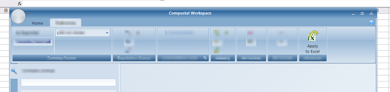

One of the leading factors is that our suite of applications have some degree of integration with Microsoft Office, specifically Excel. While currently we are only supporting the 2003 version of the software in beta, there is a strong emphasis on supporting the 2007 version in the very near future. Using the ribbon pattern in our software positions us to have a degree of cohesion with Office 2007 as well as preparing our application for the future. As and example of this principle, I use SnagIT 9 which also uses the ribbon pattern in the SnagIT editor.

But, just because Microsoft does it, doesn’t mean we should do it, right? There are certainly a few negative factors that must be taken into account. One of the advantages of Menus is that the text description of the action is directly associated with the taxonomy, and offers the user the possibility of exploring the product’s capabilities through this taxonomy. Explorability is important and menus do offer a very structured way of exploring a product. However, the “taskonomy” of the Ribbon offers an alternative form of explorability that I think will prove to be superior as time progresses.
Another issue with the ribbon is the context-aware tabbing of the tools. Traditional toolbars show everything on the screen at once. Some are relevant to the current task, others are not. The ribbon allows the user to just see tools relevant to the current task and related taxonomy. However, there are times that a user needs a tool from another tab and the inclusion of tabs increases the effort to reach this tool. Multiplied over numerous uses, this can be an amplified excise. However, the ribbon pattern offers a “quick” toolbar that shares space with the titlebar (usually wasted space in my opinion). These tools are always availabe regardless of the ribbon tab space. The application menu also provides access to additional behaviors that are universally available.
Keyboard navigation, initially, seems to suffer also. With menubars and menus, the user could navigate the menus with a keyboard. People usually notice that without menus, it appears to be mouse-only. However, the Ribbon will display immediate keyboard hints when the “alt” key is presed on the keyboard. In my opinion, this is superior keyboard navigation because the possibilites are immediately displayed to the user.
Fitts’ law is also applied, although still with problems. Tools with frequent use can be made larger and include text to allow the target behavior to require less effort. Unfortunately, a small strip of dead space above the quick toolbar breaks Fitts’ law making a maximized application more difficult when approaching the quick toolbar; effectively, this slows the use of a “quick” toolbar.
The other major factor in using the ribbon is that many people are not comfortable with it. This is an unfortunate truth of human behavior: change is difficult to accept. In my opinion, all good things come with change. I believe that the ribbon will eventually become familiar to people as they continue to work with the tools and as they become increasingly more popular.