Style and Tone, part 2

The last time I discussed Style and Tone, I focused mostly on style. Today, I want to talk more about tone. Tone is kinda-like the tone of voice we use when speaking with each other. If I say, “you’re the greatest” but I use a tone of voice that demonstrates that I don’t mean it, I’m probably being sarcastic. Much of what we call sarcasm is the result of saying one thing, but using a tone of voice that conveys another meaning. Our tone is a way of conveying messages without words.
Software design (including Web sites) convey a certain tone without using words. The way a visual interface looks and communicates to the user conveys a design tone. Many times software will convey a tone that is inconsistent with the type of tone that the software developers would like to convey to their users. Sometimes, software tone can be condescending, arrogant, unfriendly or obtuse. Most of the time, software should be inviting, friendly, user-centric and amiable. These are tones that a piece of software (or Website) can convey with sensory immersion techniques.
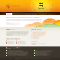
Take a look at this screen of a Web site:
Some of the words were left un-blurred because they play a small role in tone. Both style and language play a role in tone, but much of it is strictly visual. This site has a “friendly” and “playful” tone. Certainly, with a paragraph beginning with “We are…” one might think that the site is a little self-centered; which might be true. But it is consistent with a tone that I would call “open.” The site is up-front and honest about who it represents in addition to stylistically inviting the user in. Some of the text begins with “Hello…” which tempers the self-centered text above. In addition, we see call-out bubbles, and paper airplanes in an open sky above clouds. It is imaginative and open, but the green at the bottom “grounds” it in reality. The site makes it clear that it (and the people behind it) want to have a dialog, or conversation with you, the user, and they want to skip some of the typical formalities in doing so.
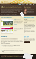
For a little bit of contrast, look at this site screen shot:
While the visible text might make it seem conversational in the same way the previous site did, there are some subtle differences in tone here. They say, “Hello,” but end up looking far more self-centered than the previous site. This site is obviously proud of themselves with their pictures on the home page (avante garde styling aside), their obvious “Check (us out)” intro and the incredible emphasis on Mac hardware/software (no actually affiliation, just a bit of pride).
The “Let’s talk” is less friendly and the style is more of a ‘coolness’ and an ‘aloofness.’ I would call this tone, ‘cool and proud.’ This tone is very appropriate for their business and it isn’t a negative connotation. This appears to be the right tone for the customer and works for them. It is merely a contrast with the previous site.
Try this site on for size:
What do you make of this tone? What do they represent? Who are they? Leave your comments on this post and share!


