The Basics of Color Theory

The Basics of Color Theory
Colors are important to making things look good, whether it’s the clothes you wear or the presentation you give at work. But not everyone instinctively knows that orange and blue is a perfect combination. If you can’t trust your own judgement, understand and rely on the basics of color theory to always pick the right colors.
Learn the Color Wheel
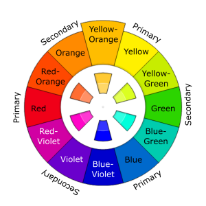
This is the basic color wheel and it will guide you in making color choices.
Red, blue and yellow are primary colors. When you mix red and yellow, you get orange; mix blue and yellow, you get green; mix red and blue, you get violet. Orange, green and violet are hence called secondary colors. Tertiary colors like red-violet and blue-violet are derived by mixing a primary color with a secondary color.
All colors have tints and shades. A tint is the variation of that color when mixed with white; a shade is the variation of that color when mixed with black. But generally, you don’t need to worry about tints and shades for basic color schemes.
In the color wheel, there’s yet another separation that you need to be aware of so that you can understand color schemes better: warm and cool colors. Each has its own purpose to convey emotions. Warm colors exhibit energy and joy (best for personal messages), while cool colors convey calmness and peace (best for office use). The wheel itself can be divided easily to get an idea of which colors are warm and which ones cool.
Master the Basic Color Schemes
Based on the wheel, there are a few basic rules to match colors. And they’re actually pretty simple.
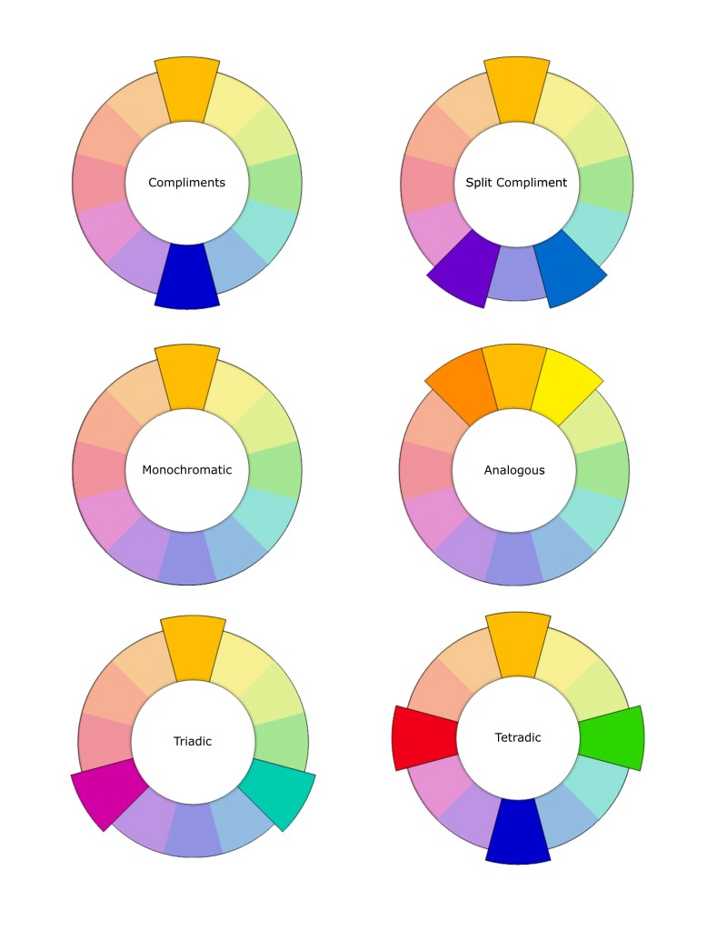
Complementary colors are any two colors opposite each other on the wheel. For example, blue and orange, or red and green.
These create a high contrast, so use them when you want something to stand out. Ideally, use one color as background and the other as accents. Alternately, you can use tints and shades here; a lighter tint of blue contrasted against a darker orange, for example.
Split complementary colors use three colors. The scheme takes one color and matches it with the two colors adjacent to its complementary color. For example, blue, yellow-orange and red-orange.
This scheme is ideal for beginners because it is difficult to mess up. That’s because you get contrasting colors, but they aren’t as diametrically opposite as complementary colors, says Tiger Color.
Analogous colors are any three colors next to each other on the wheel. For example, orange, yellow-orange, and yellow.
With analogous colors, it’s best to avoid hues as they can be jarring. Instead, focus on tints of analogous colors. Another tip Color Wheel Pro shares is to avoid combining warm and cool colors in this scheme.
Triadic colors are any three colors that are equally apart on the color wheel. For example, red, yellow and blue.
The Triadic scheme is also high-contrast, but more balanced than complementary colors. The trick here, Decor Love says, is to let one color dominate and accent with the other two.
Tetradic or double complementary colors uses four colors together, in the form of two sets of complementary colors. For example, blue and orange is paired with yellow and violet.
This is the hardest scheme to balance. It offers more color variety than any other scheme (but) if all four colors are used in equal amounts, the scheme may look unbalanced, so you should choose a color to be dominant or subdue the colors. Avoid using pure colors in equal amounts.


